Google redesign – more minimalist than ever
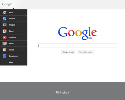
Google seems intent on stripping its design to skeletal proportions. It's not just Google either. Microsoft's Bing is essentially Google with some diamante bedazzling it's portal.
If you thought Google couldn't get any more minimalistic with its design… you were wrong! The top navigation bar (hardly cluttersome you might think) is going, to be replaced by a drop-down menu accessed from a plain gray logo top left. Technical Lead, Eddie Kessler said in a blog post:
Making navigation and sharing super simple for people is a key part of our efforts to transform the overall Google experience
Especially, Google are looking to make it easier for users to navigate quickly between Google services. And these days, you might well read that as "making it more Google+ friendly".
Combating design obesity or suffering from design anorexia?
When most folks think of web design they think of graphics. Indeed, despite many emphatic claims to the contrary, web designers are graphic-centric to say the least. Despite much being talked about simplicity, clean design and whitespace, there are gallery-upon-gallery of highly decorative websites out there. And Dribble is a veritable smorgasbord of eye candy.
And now, given all the exciting new toys that HTML5 gives to designers, why does Google seem intent on stripping its design to skeletal proportions? It's not just Google either. Consider Microsoft's approach with Bling. Er, sorry, I mean 'Bing'. Designwise it's essentially Google with some diamante bedazzling it's portal. I know web designers who bemoan the 'lack of design'.
Minimalism isn't a lack of design
It's far harder to get a minimalist design right. The right balance of whitespace, intelligent and intuitive layout, fonts, visual hierarchy and subtle touches save them from just looking empty or unfinished.
One of the driving principles in designing user interfaces is only putting in what you need. Don't clutter things up and don't distract or confuse the user. Sure, add a dash of personality if it helps users feel comfortable and ensure consistent branding… but for highly functional sites reign in the desire to decorate.
Google is a service, a suite of cloud-based tools. It's software. And with such a dominant brand, there's not the need to bolster a weak offer with bells and whistles. So they don't.
Have Google got it right? That all depends on how users react. Not in the knee-jerk 'facebook-moved-something' kind of initial reaction, but in whether the new interface helps Google achieve its aims. Given the order of the menu items and their own stated goals, it's obvious they will measure the success of this redesign on how well it picks up traffic to Google+.
And that is the point of any design. It's not to impress web designers, feature in design galleries or be 'on-trend'… it's about delivering results.
 Written by Jason John Mills